The Impact of Color
Imagine yourself walking into a room. Everything inside is one color. All the walls, floor and ceiling are a bright red. How do you feel?
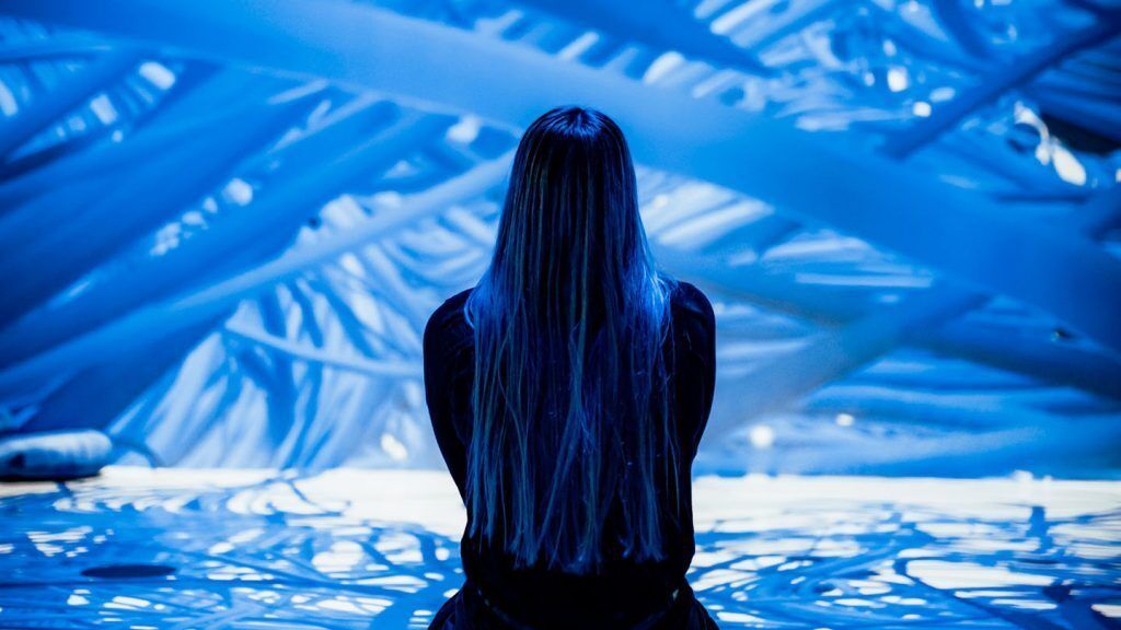
Now imagine if the room was all blue, like the current Submerge by ARTECHOUSE series of installations across our art spaces, how do you feel enveloped inside the color blue?
Chances are you would have an immediate reaction to your surroundings, and they would be quite different depending on the color. This would be based on your personal experiences with the color, its cultural associations as well as the science behind how we perceive color.
Let’s dig into each one of these areas a bit more and how they interact with each other to create the overall impact of color.
The Science of Color
Thanks to our sense of sight, we are able to perceive the colorful, visual world around us. This is done through a process where our eyes convert visible light of varying wavelengths into electrical signals that get sent to our brain, which then converts those signals into our colorful visual reality.
Every color corresponds to a different wavelength of light, ranging from higher frequencies of 700nm (red) to lower frequencies of 400nm (violet).
As light travels and comes into contact with different objects, those objects absorb some wavelengths and reflect others. What we see as color, are the wavelengths being reflected.
If we go back into our blue room, it appears blue to us because the walls and objects in the room absorb all other wavelengths of visible light, but reflect blue back to our eyes.
Additionally, what makes this incredible biological process of seeing color even more interesting is that the warm colors like red, orange, yellow have longer wavelengths and are more energetic where as cool colors like blue, green and violet have shorter wavelengths and more calming.
So when artists create with color to evoke emotions, they are actually creating with light!
The Psychology of Color
Our brain does not stop at the biological process of seeing and identifying colors. Our brain also processes the thoughts, emotions and memories that we relate to different colors.
A question often asked, and sometimes difficult to answer, is: What is your favorite color?
When this question has been researched, blue historically wins as the favorite color amongst both men and women.
According to a study conducted by psychologists Stephen E. Palmer and Karen Schloss, favorite colors are largely chosen because of the positive things we associate with that color. This makes sense for blue since there are many obvious, positive associations with blue, including water and the sky — environments that give us peace and inspiration.

Favorite colors can also be impacted by times of the year, and our most recent encounters. If you had just gone for a relaxing walk in a beautiful green forest you would be predisposed to say your favorite color is green if asked during that experience or immediately after.
In general, colors are associated with certain positive and negative qualities and our own positive or negative experiences in relation to color greatly impact how we feel about a color at any given moment.
The Culture of Color
Our predisposed associations and personal experiences with color greatly impact our perception of the world but we are a social species whose perspective is significantly shaped by the culture around us and its societal norms and indicators.
Depending on the culture you grew up in your association with a particular color might be influenced. Huffington Post shared the example that if you see a baby dressed in blue, you might assume that it is a baby boy because blue is traditionally associated with masculinity in western cultures. However, in China blue is considered feminine.
Current cultural trends and norms can also impact our experience of color. Pantone, responsible for standardizing color across industries and platforms, plays an important role in analyzing and setting color trends across industries like design, fashion and more.
Each year, they select a Color of the Year whose qualities they feel will have implications across design-based industries as well as society at large.
For example, Pantone selected Classic Blue for their 2020 Color of the Year for its dependable, calming and inspirational qualities. They made this choice as a hue to sustain us during a time of change and 2020 ended up bringing changes no one expected, making the hue of Classic Blue even more relevant.
ARTECHOUSE had partnered with Pantone for the reveal of Classic Blue as the Color of the Year 2020 and when re-opening our art spaces after being closed due to the pandemic, we thought there was no better way to help people during this time of uncertainty by immersing people in this color.
This practice of choosing a Color of the Year and ARTECHOUSE’s creative expressions of the color demonstrates how focus on color can help us transform our own outlooks and emotional states.
The Importance of Color
It is fascinating to consider the many factors that come together and influence our thoughts and emotions when we look at a blue sky, a red sign, a green forest or a white dress.
Colors can quickly help us identify and understand important information, as well as retain it long term. When we understand their impact on us we can choose or change our environment to influence our state of mind. And they help us communicate, both ideas and emotions, and can be used across industries to achieve results and define experiences.
Ultimately, colors help us navigate the world around us and add richness to our lives. Under the influence of different colors, we feel and think differently.